Preface
A navigation menu button is a great place to add a unique animation that sets your website apart. Many websites simply toggle between the hamburger icon and the x icon without any animation, and many others apply simple animations that don’t have much character - and these are all okay - but what about a menu button that will catch users’ eyes? A menu button that users will intentionally click again to watch the animation another time? Today, let’s learn how to build the animated hamburger button that I created for my 2021-2022 portfolio website. A button with some oomph.
Many good animated menu buttons use SVG, but this one relies on simple, vanilla HTML and CSS. Let’s get started.
Planning the Element
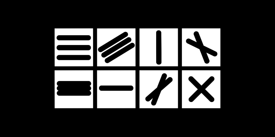
Before we jump into code, let us think about what our button element needs. The button will be the parent, and it will have 3 “bars” as child elements to make up the hamburger icon. However, the x icon only needs two bar elements. Thus, we should keep in mind that during the animation, we will want to hide the 3rd bar when transitioning to the x, and show it again when transitioning to the hamburger.
HTML Foundations
Our initial element’s HTML markup will look something like this:
We will start with a button, and nest 3 spans within it. Since an HTML button is an inline element,
we should not nest block-level elements inside of it, such as <p> or
<div> tags.
Furthermore, our button’s bars are purely decorative and do not have any semantic meaning within our HTML,
so a span tag is a good choice for them as opposed to other inline elements,
such as <i> or <em> tags.
We will also give our button an ID attribute, which allows us to select the element in our CSS
and style it without affecting other buttons on the webpage.
Congratulations! You have completed the HTML for this entire tutorial. It wasn’t easy, but we got there in the end.
CSS Foundations
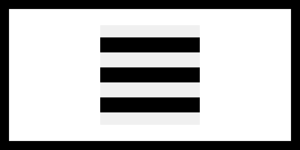
Next, let us lay the foundations of our CSS. Before we write any code, let us simply think of our hamburger button as a square grid with whatever side length is most useful to us. There are no wrong side lengths here, but there are worse side lengths than others. Think lazily here, and find the side length that will be most easy to work with. My intuition tells me we should use 100px by 100px for now, that way we can think of things in terms of 0% to 100%. Don’t worry that we have chosen a fixed pixel value here; we will make this fixed size into a responsive size once we have our element completed. Also, note that although we are thinking in terms of 0% to 100% for our 100px by 100px grid, we will NOT be setting the menu button’s width and height with CSS percentage values.
First, let us start with some boilerplate code. We will not worry about the x layout until we have established the hamburger layout. Thus, our code will begin as follows:
After setting the width and height of the menu button, we set display: flex;
and flex-direction: column; on our button to arrange the spans in a column.
We set justify-content: center; to center the spans in the container
(vertically, since this is a column layout), and gap: 15px; to add space between our bars
(I chose the same value here as the height of the bars).
We also set padding: 0; on our menu button and width: 100%;
on our bars so the bars will extend all the way to the edge of the button.
This provides the foundation of our hamburger layout,
and you should be left with an icon that looks something like this:
Applying Animations
Now, we must think of how we will lay out the x icon bars. Again before we touch any code, think about what needs to be done. We will be animating all three spans (bars) to achieve this new layout. Thus, our top and bottom bars will have to move towards the center (since our x will be centered, all bars will cross in the perfect center of the menu button). We also know that we will only need two bars for the x. Thus, we will do something to conceal the third bar. Lastly, we know that we will need to rotate two bars so that they will be perpendicular to one another (with an angle of 90 degrees of rotation between them). A couple of simple choices would be to rotate only one bar by 90deg (which would give us a plus “+” shape that we could rotate to an x), or one bar by 45deg and another by -45deg. However, for the sake of this menu button’s animation, we will instead choose to rotate one bar by -45deg and another by -135deg.
Toggle the Element’s State
With the animation in mind, let us also think of how we will trigger it. An obvious solution is to toggle a class name when the user clicks the button. We will start with this approach, but we will later find out why there is a better solution. Changing to this solution later on will not change very much in our code, so don’t worry about this just yet. Therefore, we will add a function in our JavaScript that toggles the menu button’s “active” class, and set the onclick event for the menu button element to that function, and so we will have the following code:
We defined a function to toggle the menu button,
then selected the menu button element in the HTML using document.getElementById ,
then assigned the function we created to the element’s onclick event.
Nothing should have changed in your icon yet, but we are about to hop back into our CSS and change that.
Animating to X
Before we hit the code, think back to what we decided about the animation. Our outer bars will need to translate to the center, then we will rotate one bar -45 degrees, another bar -135 degrees, and conceal the 3rd bar. We could transition the translations and rotations all at the same time, but the end result will look messy. Thus, we will decide to use CSS keyframe animations to first translate the bars and then rotate the bars, which will give us the effect of a “two-step” animation. We will add the following code to our CSS:
First, we set an arbitrary animation duration for our bars.
We then set animation-fill-mode: forwards; ,
which tells the browser to keep the animation at its end state upon completion.
By default, the element would snap back to its original state after the animation completed,
and thus we override it for the sake of our menu button. We then set an animation timing function,
which adjusts the rate at which elements progress through animations.
The default value is linear ,
where elements progress through the animation at a constant rate.
We set ease-in-out so that the animation starts slowly and ends slowly, speeding up in the middle.
This gives the animation a more natural feel. Feel free to tinker with this value to see how it affects the animation.
Next, we selected each of our spans using the :nth-child selector, and set an animation on each of them.
Lastly, we defined our animations as follows:
@keyframes to-x-top
The to-x-top animation starts with no translation and no rotation. At the animation’s halfway mark, the bar has translated downwards by 30px (equal to the 15px bar height plus the 15px gap between it and the next bar) and still has no rotation. At the animation’s end, the bar is still translated downwards by 30px and has rotated by -45deg.
@keyframes to-x-mid
The to-x-mid animation differs from to-x-top and to-x-btm because we only need to animate the middle bar’s rotation. This animation starts with no rotation. At the animation’s halfway mark, the bar still has no rotation. At the animation’s end, the bar is rotated by -45deg. By rotating it the same as our top bar, we effectively conceal it by “combining” it with the top bar. Note that we don’t need to specify the 0% mark on this animation, since the animation is unchanging from 0% to 50%.
@keyframes to-x-btm
The to-x-btm animation mirrors the to-x-top animation. It starts with no translation and no rotation. At the animation’s halfway mark, the bar has translated upwards by 30px (equal to the 15px bar height plus the 15px gap between it and the next bar) and still has no rotation. At the animation’s end, the bar is still translated upwards by 30px and has rotated by -135deg.
X Animation Check-Up
At this point, your button should look something like this:
Animating to Hamburger
Now, we will define the animations back to our hamburger layout from our x layout. We have done the hardest work with our last set of animations, and now we only need to “undo” the animations. Thus, we will add the following code to our CSS:
We again select each of our spans using the :nth-child selector and give them their own animation.
Then we define our animations as follows:
@keyframes to-hamburger-top
The to-hamburger-top animation starts with a 30px downward translation and -45deg of rotation, to align with the end of the to-x-top animation. At the animation’s halfway mark, the bar is still translated downwards by 30px and is rotated back to 0deg of rotation. At the animation’s end, the bar is translated back upwards to 0px of translation and stays with 0deg of rotation.
@keyframes to-hamburger-mid
The to-hamburger-mid animation differs from to-hamburger-top and to-hamburger-btm because we only need to animate the middle bar’s rotation. This animation starts with -45deg of rotation, to align with the end of the to-x-mid animation. At the animation’s halfway mark, the bar is rotated back to 0deg of rotation, which aligns with the top bar animation. At the animation’s end, the bar stays rotated by 0deg. Note that we don’t need to specify the 100% mark on this animation, since the animation is unchanging from 50% to 100%.
@keyframes to-hamburger-btm
The to-hamburger-btm animation mirrors the to-hamburger-top animation. It starts with a 30px upward translation and -135deg of rotation, to align with the end of the to-x-btm animation. At the animation’s halfway mark, the bar is still translated upwards by 30px and rotated back to 0deg of rotation. At the animation’s end, the bar is still translated back downwards by 30px and stays with 0deg of rotation.
Hamburger Animation Check-Up
At this point, your button should look something like this:
Making it Responsive
Keep in mind our two button states:
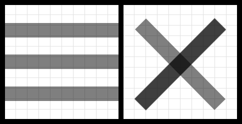
The bars are 15px tall with 15px between them in the hamburger layout. It doesn’t matter where exactly the bars fall inside of the 100px by 100px grid for either layout, only that they are centered within it. To achieve the x layout, the outer bars translate on top of the middle bar, then two bars rotate -45deg and one bar rotates -135deg, giving us the x layout.
Now that we have our basic layout at 100px by 100px, we want to make it so that the button can be any size. We will use CSS variables to achieve this. Since we were lazy and set our menu button’s width and height to 100px by 100px, this task will prove to be relatively simple.
Element Sizing
In our menu button’s CSS, we will define --btn-size: 100px; .
We will use this variable on the button’s width and height as follows:
Next, we will set the gap between bars and the height of the bars based on this --btn-size value,
using the CSS calc() function to do the math for us, as follows:
Now you can see why using 100px by 100px makes this job easier.
The units that we already set will simply be divided by 100 and multiplied by our --btn-size variable.
Before we continue, let us create two other variables - —bar-height and --bar-spacing -
to replace the values that we just set. This makes the code more explicit,
since rather than using calc(var(--btn-size) * 0.15) throughout the element selectors and their
animation definitions, these values will be named after their purpose.
It also means that if you were to slightly tweak these values,
you wouldn’t need to update them in several different places, and could just update the one variable’s value.
However, do note that these two variables are not intended to be changed
(whereas the --btn-size variables IS meant to be changed),
and so major tweaks to --bar-height or --bar-spacing might cause unexpected behavior.
These two values are only intended to respond to changes in the --btn-size variable.
With that tangent out of the way, we will make the following changes to our CSS:
Animation Values
Now, we will update our animations to use the --bar-height
and --bar-spacing values, as follows:
Let’s explain what we have changed here.
First, remember that the top and bottom bars were translated 30px in a vertical direction,
since the bar was 15px tall and the gap between bars was 15px.
We would add these two values together to get 30px. Thus, in our vertical translations,
we are replacing 30px with calc( var(--bar-height) + var(--bar-spacing) ) . Furthermore,
since the bottom bar is mirroring the top bar, we are multiplying this number by -1. Thus,
the bottom bar’s -30px is replaced with calc(-1 * (var(--bar-height) + var(--bar-spacing)) ) .
At this point, you should be able to set the --btn-size variable to any value that you want,
and the button and its animation will scale accordingly.
Note that the button looks best when given a size of at least 20px,
but the sky’s the limit for how large you can make it!
Polishing the Element
Now, let’s polish the way the element looks.
Button Styles
First, we will unset some of the button’s default CSS styles. By default, HTML buttons are given a border and a background. We will unset these styles by adding the following:
Bar Styles
Next, we will tweak our bars.
Border Radius
Let us add border-radius: var(--bar-height); to them,
so that the border-radius will scale with the rest of our menu button element,
as follows:
Bar Color
Now, we will pull the background color of our bars into its own variable called --bar-color ,
which we will place in the menu button selector next to --btn-size .
Animation Speed
We can also pull the animation speed out into its own variable, placing it next to the other variables that are intended to be changed, as follows:
Add More Oomph
This looks nice, but it just isn’t it. Let’s also rotate the entire menu button by 90deg during the first half of the bars’ animation. Make the following changes to the CSS:
Here, we are specifying that the menu button’s transform property’s transition will take half
the duration of the bars’ animation. We also created the --animation-timing-function
variable and have both the button and the bars use that variable. Furthermore,
we specify that when the menu button has the active class, it will rotate by 90deg.
At this point, we have this:
Preventing Animation on Page Load
Remember earlier when we decided we would trigger our animation by toggling a class name on our button?
You may have noticed an issue with this. Namely, every time the page loads, our “to-hamburger” animations fire.
This is unintended behavior, as we only want our animations to fire when the user clicks the button.
We will use HTML data attributes to fix this issue.
Data attributes are custom attributes you can add to an HTML element,
identified by the name pattern data-* . In our case,
instead of toggling the “active” class as we have been doing,
we will toggle a data attribute that we create, called data-state .
The state will be set to “x” when the user triggers the button to its x layout,
and then will be set to “hamburger” when the user triggers the button to its hamburger layout.
Our button will only animate when the data-state is set,
and the data-state will not be set when the page loads.
First, let us tweak our JavaScript so we have the following:
Now, we need to replace all instances of .active in our CSS
with [data-state="x"] , as follows:
Similarly, we need to add [data-state="hamburger"]
for our hamburger animations, as follows:
Now, when we first load the page, our menu button does not animate, but when the user clicks the button, it toggles the animation between the two states as intended!
Final Polish
Now, we can simply organize the CSS a bit to make it more readable if we or someone else needs to come back to it and tweak something. For our code, we will alphabetize our selectors’ CSS properties, grouping the variables at the top of each selector and adding comments that indicate which variables are tweakable.
Congratulations!
Our responsive and animated menu button - made with vanilla HTML, CSS, and JavaScript - is complete!